The Design of a Story
Stu Bayley, our very talented Director and Art Director, talks us through why he thinks having strong visual design skills are a huge benefit when directing a story.
Take it away Stu…
So, for me the most exciting time of any project is the pre-production phase, when you are developing various creative routes in response to a brief. My background in concept design where I spent most of my days developing cool concepts to bring stories to life, gave me the core skills to start directing my own shows. I truly believe having this fundamental understanding of design principles gave me the foundation to become an effective storyteller. The principles of design are the skeleton key to the creative universe.
Learning to see with an artists eye gives you the ability to apply a filter to the world. It is a powerful tool to be able to compose various elements in a story and convey a narrative.
Below are the seven main elements of design that I apply to projects I’m working on. You may recognise these principles by different names, but what I’m talking about is a universal to creativity. The eighth principle I also use would be ‘unity’ which is the balance of the other principles to make the whole, but that’s another article.
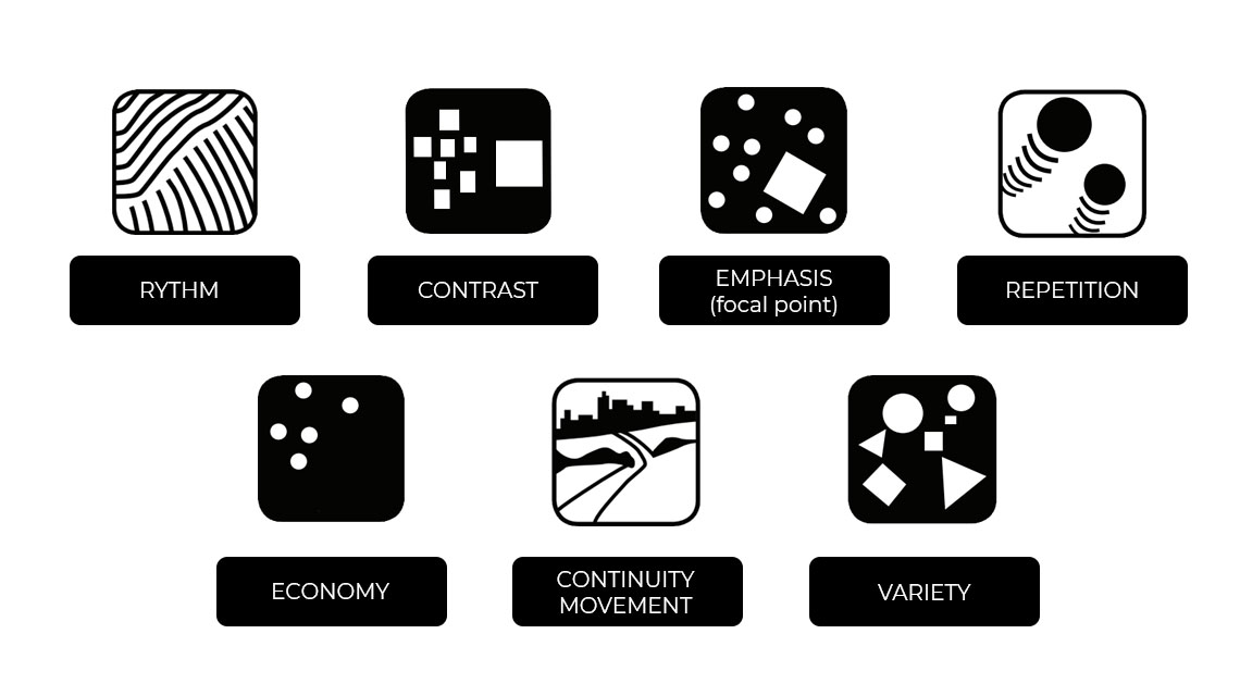
Firstly I want to highlight the general elements used when constructing a story.
Character / Context / Conflict / Creation
So, at a base level you need a character, existing in a location who has conflict they need to overcome. These are the building blocks you need to create a story. For the sake of this blog I’m going to focus my attention on one of those key elements, the character, and break that down into four key components that will normally be present in any film or script you write. I will also show you some examples from film and TV that will hopefully demonstrate my thinking.
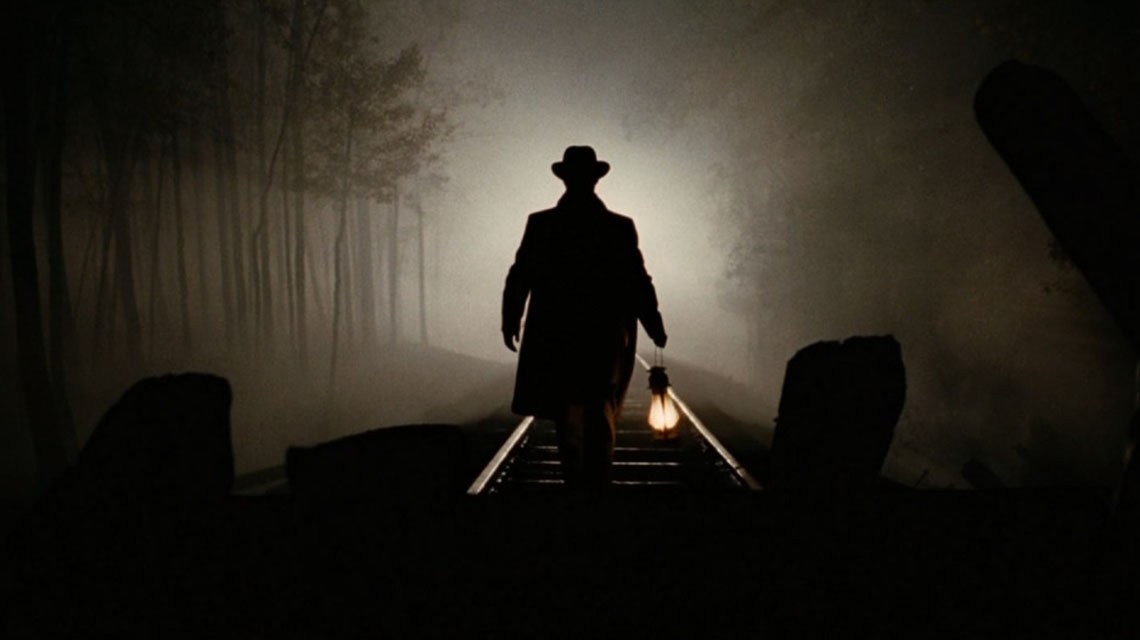
Designing a silhouette is the same as creating a unique personality
![]()
The key to great image composition is a well defined focal point. This visually arresting point will always draw you back to it, your eye may wander but it always comes back to the part of the image you have designed to have the greatest contrast. This in my opinion is the key to a great lead character. The Assassination of Jesse James by the Coward Robert Ford is a great example of a truly engaging lead character. Its a stunning performance from Brad Pit. Every second he is on screen you feel tension due to the unpredictable nature of his character. He truly draws you in even though he feels dangerous. That’s the dichotomy of human nature.
![]()
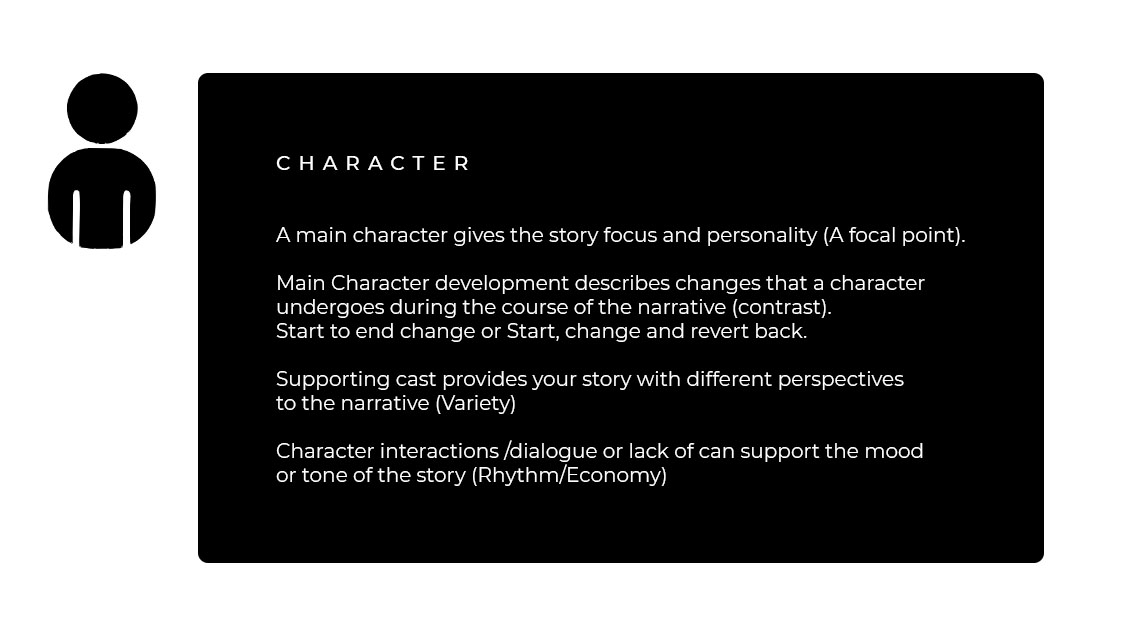
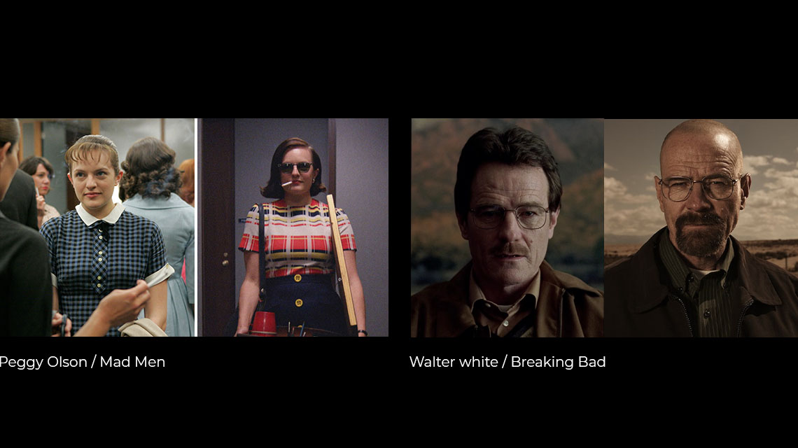
- Main Character development describes changes that a character undergoes during the course of the narrative (contrast/variety).
Here are two examples of characters that have possibly the greatest character development in recent TV. Looking at the images it is as clear as day. I think the saying goes ‘variety is the spice of life!’. When designing anything this should be your mantra because without variety there is no journey. Think of your characters as a painting that needs light and shade, that needs hard and soft edges. This contrast is appealing because your eye and your mind will be entertained by the discovery of the differences you play against each other.
![]()
![]()
- Supporting cast provides your story with different perspectives to the narrative (variety), and moves the story forward through each scene (continuity)
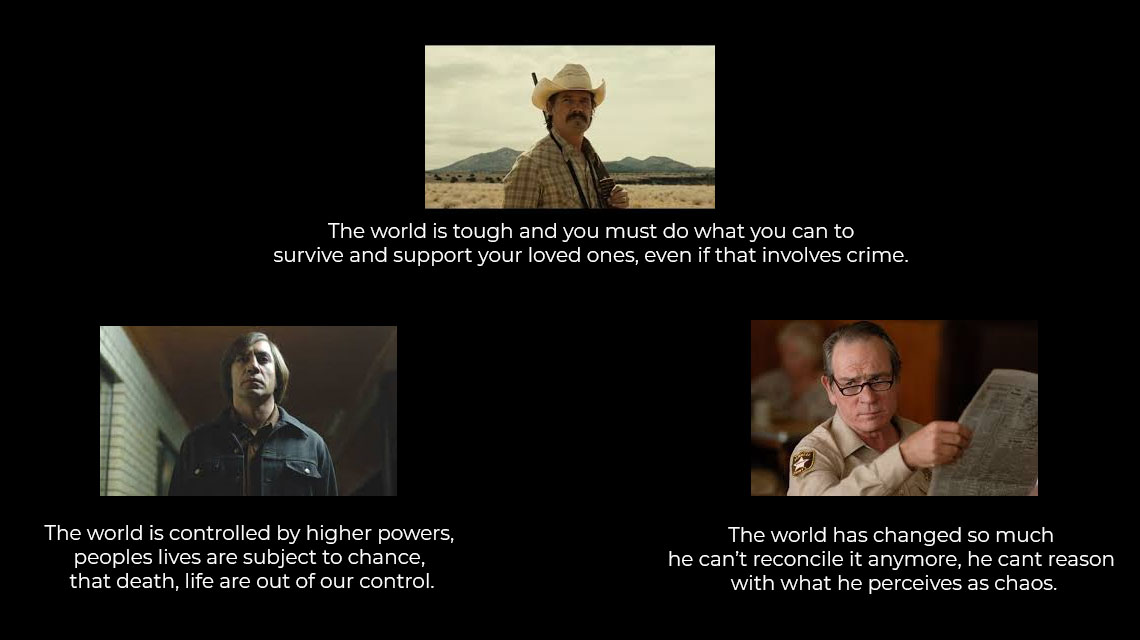
In the ensemble cast for ‘No Country For Old Men’ the three leads display totally opposing perspectives on life, yet they are inexplicably linked through an event that has occurred. The variety of these characters are key to creating interest. The extra element I think about when writing a supporting cast is movement. These characters help to move the story forward by revealing information that progresses the lead characters journey. Just as a beautiful landscape photo, there are pathways with secondary and tertiary focal points for your eyes to wander across, but they always lead you back to the main focal point. This is what makes a beautiful image, the same can be said for stories.


- Character interactions /dialogue or lack of can support the mood or tone of the story (rhythm/economy)
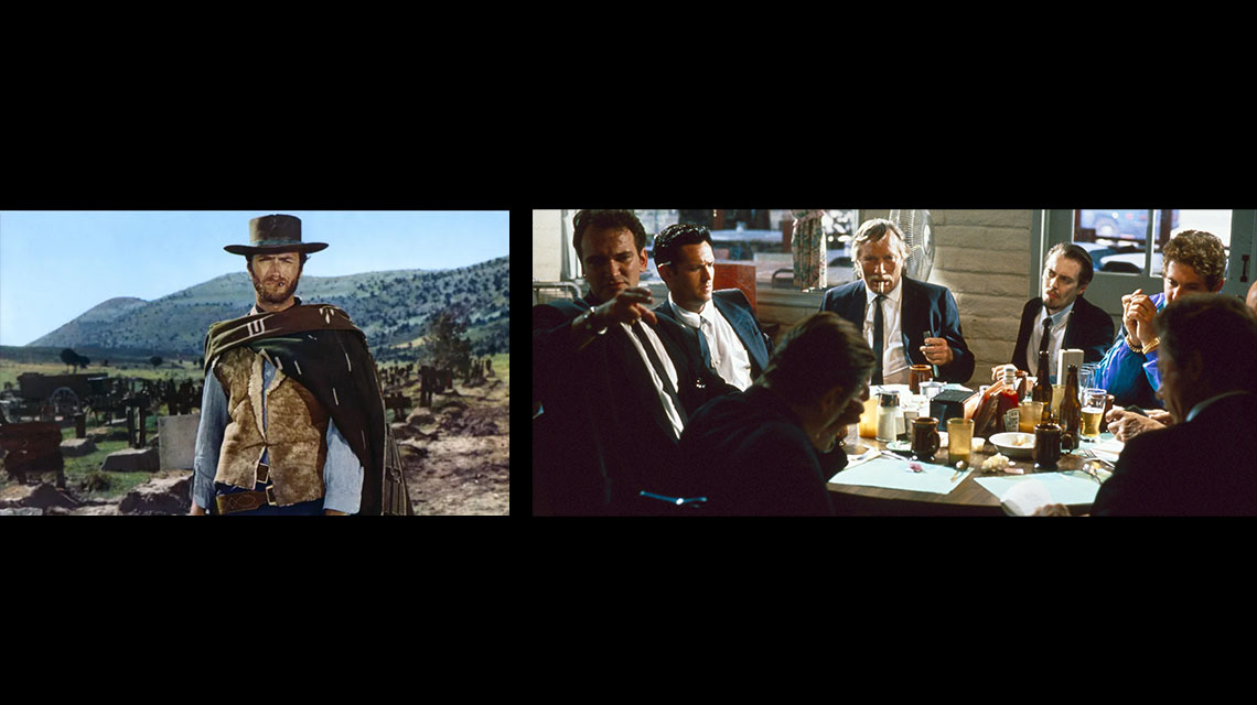
Here are two examples of polar opposite ways of dealing with character interactions. Clint Eastwood in ‘The Good the Bad and the Ugly’ is a man of few words. The intentional choice by the Director Sergio Leone to have minimal dialogue creates tension within the story. His economy of words leaves our minds open to interpret his thoughts, and economy is the same when painting. If you leave some areas abstract and less refined the viewer can fill in the blanks with their imagination and often this is when you will get the best engagement.
Another way to deal with character interaction is through more dialogue heavy interactions , and director Quentin Tarantino is the master of this. In this classic opening scene from’ Reservoir Dogs’ he uses rhythmic monologues to cleverly foreshadow events that will occur later in the film. The flow of conversation sets the tone and creates a chaotic rhythm of interactions that we see from the outset.
As with mark making and shape language in design, the choice of smooth or angular forms will have a great impact on the rhythm of your work. Smooth horizontal lines with create a sense of calm and stability, while jagged angular lines are dynamic and aggressive, this is the same dialogue. I would argue if this scene was a painting it would have more of the latter.
So to conclude, this is a brief glimpse into the way I think about story in relation to my design background. I feel the more you learn in life the more connections you see. For me that makes learning new things exciting and, more importantly, not something to be scared of.
If I can recommend one thing for your artistic career, whether that’s FX, Concept art, Script writing, Animation. Knowing the fundamental principles of design will help you to see the world through a new lens and unlock a code that is present in all artistic endeavours. Below are some of the best sources of information on the subject I know of. I hope they help!
Composition 1 Workshop: Design Theory – START! and Level Up on ConceptArt.Org from Jason Manley on Vimeo.


